
Case Studies
Oral-B® Packaging Redesign
Making oral care more approachable, one box at a time.
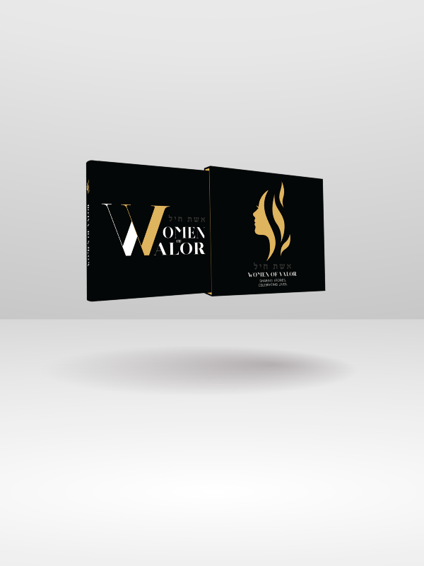
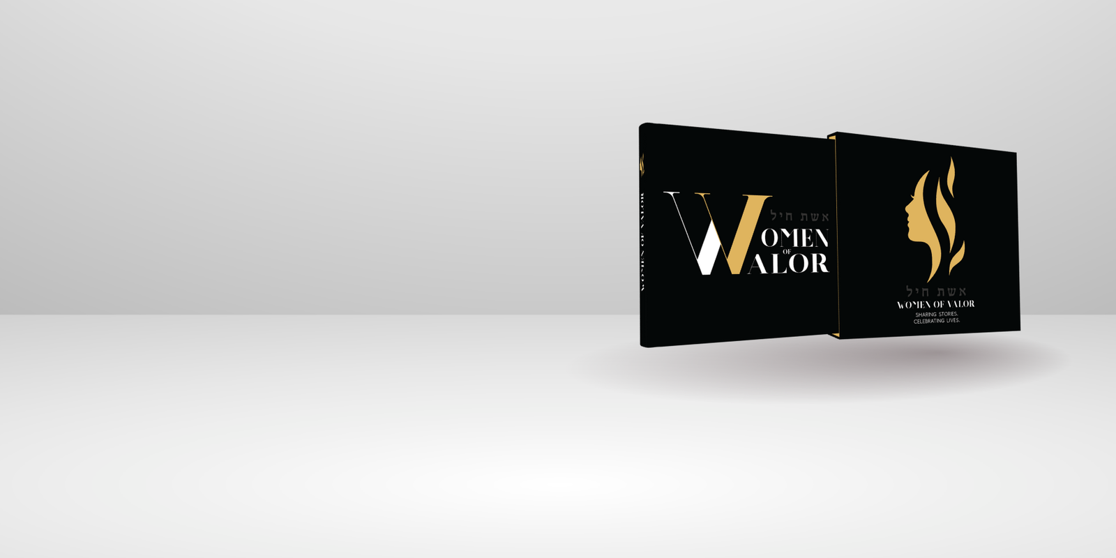
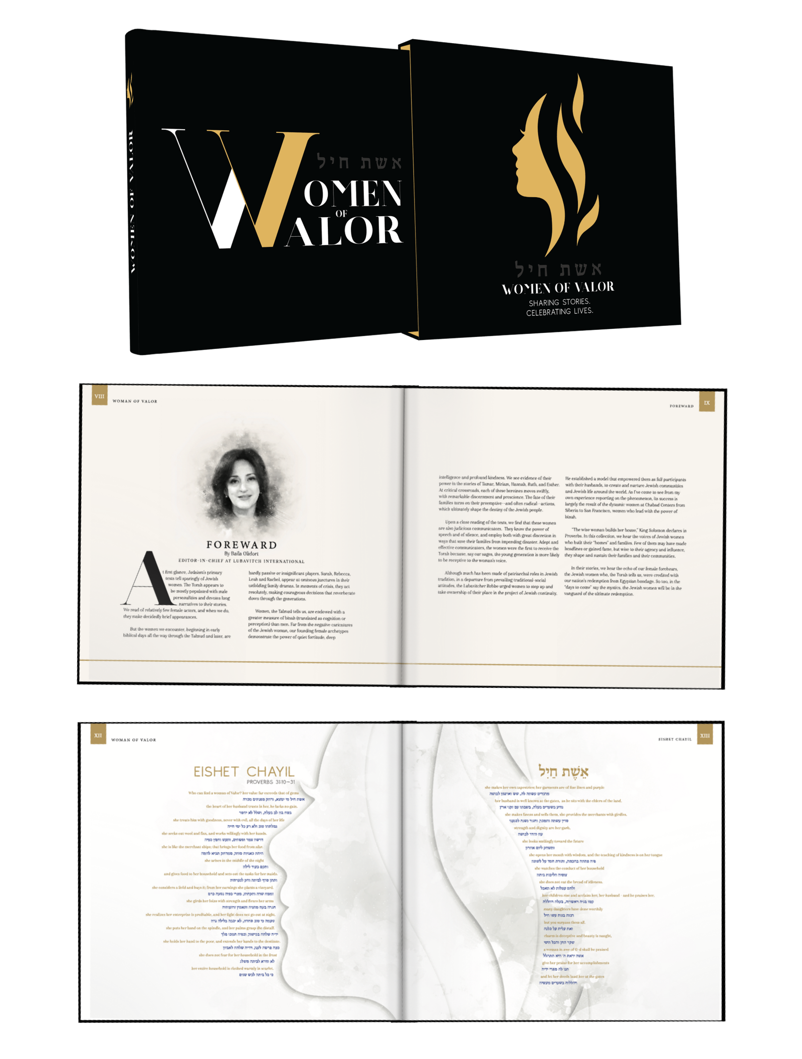
Women of Valor Coffee Table Book Design
Celebrating the stories of women who inspire, through thoughtful design.
Crest® Whitestrips Packaging Design
Bringing simplicity and shelf appeal to a trusted oral care product.
Scope® Outlast 4 in 1 Mini Brush Packaging & Product Design
Big freshness, pocket-sized.
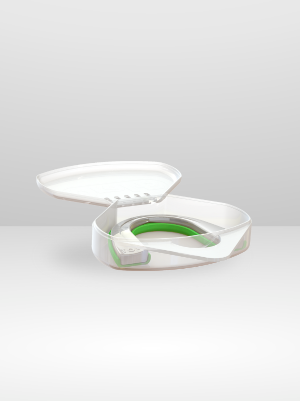
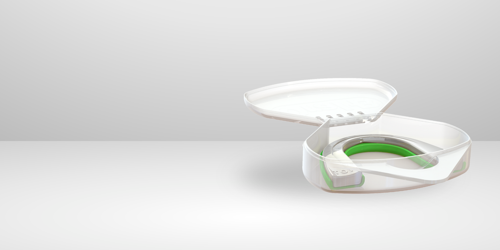
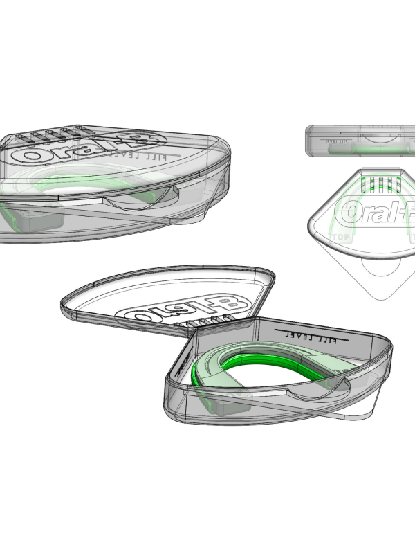
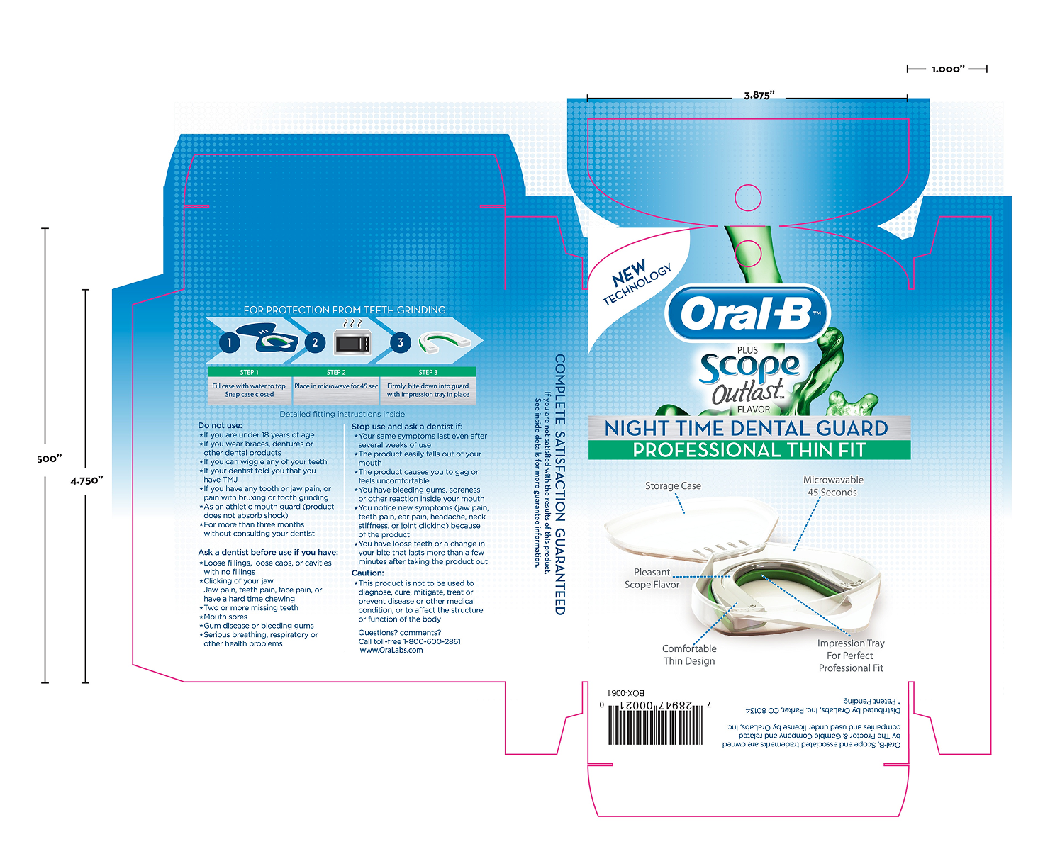
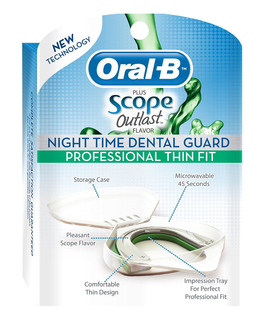
Oral-B® Dental Guard
Packaging Redesign
Type
Package Design
Client
OTC Manufacturer
Year
2012
Tools
Adobe Creative Suite
Overview
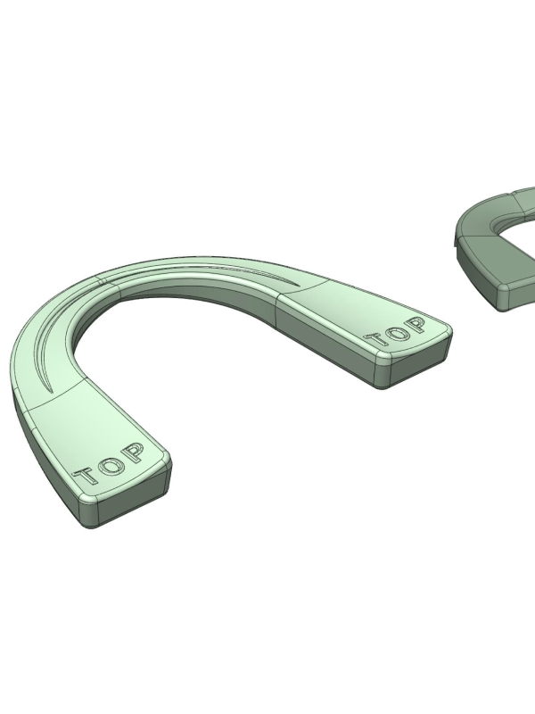
Oralabs® (formerly HeathTech Inc.) manufactures private-label over-the-counter oral care products, including dental guards sold under the Oral-B® brand. Our team was asked to redesign the Oral-B® Dental Guard packaging to create a clearer, more user-friendly experience while meeting established brand standards.
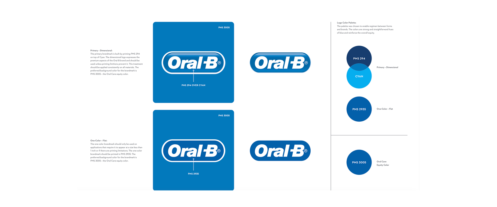
Oral-B® Style Guide
The Challenge
User testing showed a few key areas that could be improved:
✔ Some found the dental guard bulky and uncomfortable
✔ The fitting instructions were difficult to follow for some users
✔ A window box design limited messaging space and increased production complexity
These insights shaped the direction of the redesign: improve clarity, reduce material use, and better reflect the updated, more comfortable product.
My Role
As the Package Designer, I collaborated with the product development team to:
✔ Refine the visual layout to better guide the user
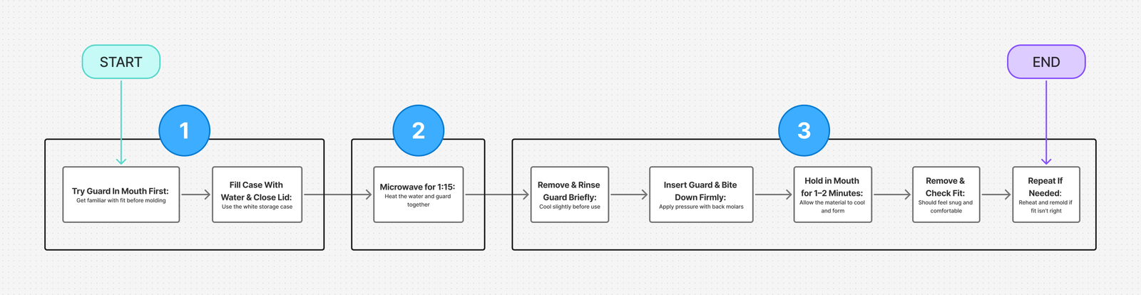
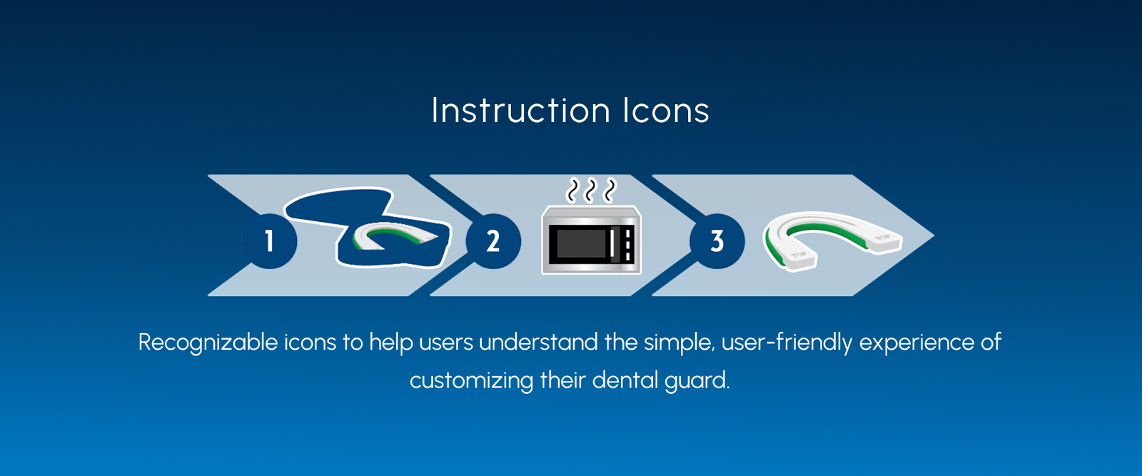
✔ Replace long blocks of text with a step-by-step visual instruction panel
✔ Highlight the updated, slimmed-down product
✔ Adjust structural elements to reduce unnecessary packaging materials
Key Considerations
Comfort & Product Perception:
The updated dental guard was thinner and more comfortable. Our task was to ensure the packaging communicated that improvement effectively.
Instructional Clarity:
Users found the original fitting instructions difficult to follow. Improving how the information was presented became a priority.
Space & Cost Constraints:
The existing window box limited usable space for communication and required additional inserts, which increased production costs.
Design Process

1. Research & Insights
We gathered feedback from beta testers and internal teams to better understand where users were getting stuck. The main insights included:
• Discomfort with the previous bulky guard
• Some confusion around the fitting process
• Instructions that were easy to overlook
• Packaging structure driving up costs
2. Goals
✔ Align with Oral-B® brand guidelines
✔ Simplify the instruction panel using visuals
✔ Highlighting the slimmer, improved guard
✔ Reduce production costs without sacrificing quality
Solution
Visual Hierarchy & Simplicity
We removed the window from the box, which allowed more space for product messaging while simplifying the structure and reducing material costs.
Instructional Illustrations
To support a smoother fitting process, we simplified the dense instructions and added a simple, icon-based 3-step guide to follow each step. The visual format helped make the customization feel more approachable both on the packaging and in digital contexts.
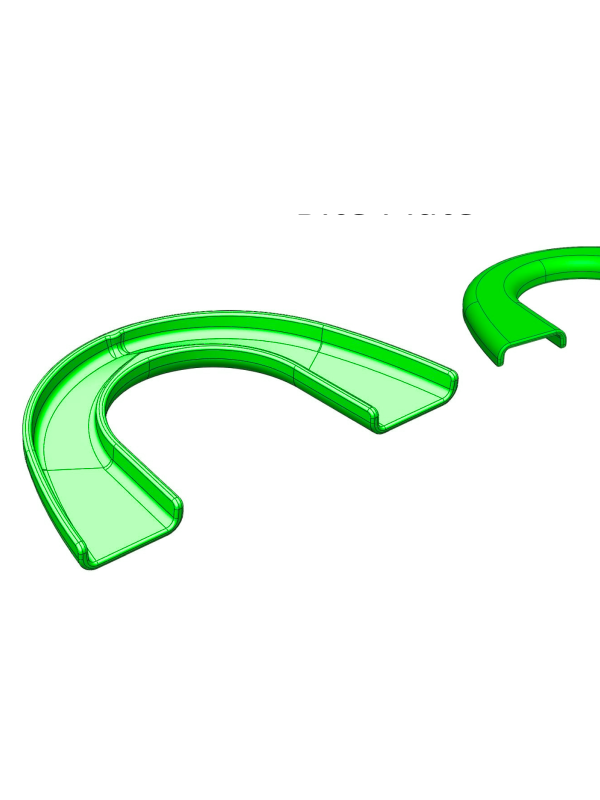
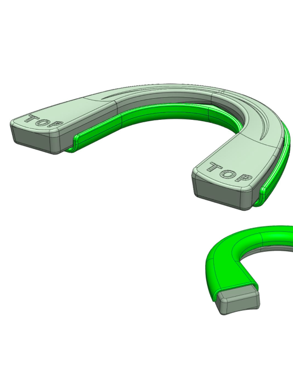
Structural Improvements
Adjustments to the internal layout made the product easier to secure and display, while eliminating the need for extra inserts.
Final Design
The final packaging reflected the updated guard’s comfort and ease of use. With reduced materials and simplified visuals, the design balanced clear communication with production efficiency.
Outcome & Impact
✔ Brand Alignment:
Packaging followed Oral-B® brand standards closely, maintaining a familiar and trusted look.
✔ Clarity for Users:
Instructions were updated with visual cues to support a smoother, more intuitive experience.
✔ Improved Messaging:
The slimmer design was communicated more clearly, helping set expectations around comfort and fit.
✔ Production Considerations:
Removing unnecessary materials helped simplify manufacturing and reduce costs.
Initial feedback from both internal teams and customers pointed to a clearer, more approachable experience overall.
Reflection
This project was a reminder that packaging is often the first experience someone has with a product, and that experience matters. By focusing on clarity, accessibility, and structure, we were able to make the product easier to understand and more approachable, while also supporting broader business goals around efficiency and brand alignment.
Women of Valor Coffee Table Book Design
Type
Book Design
Client
Religious Non-profit
Year
2022
Tools
Adobe Creative Suite
Overview
Women of Valor is a limited-edition coffee table book that honors the personal stories of extraordinary women within the Boca Raton community. Each portrait and page is designed to reflect the strength, grace, and humanity these women embody.
The book pairs compelling stories with digitally painted portraits to create a visually rich, meaningful keepsake.
My Role
As the book designer, I was responsible for:
* Book layout, typography, and visual hierarchy
* Preparing files for professional print production
* Designing promotional videos and materials for the book launch event
Design Process
1. Discovery & Content Planning
Working closely with the group, the team and I gathered personal stories, photographs, and source materials for each featured woman. We aligned on tone, visual direction, and production timelines.
2. Visual Language Development
I aimed for a clean, modern layout that gave each story and portrait the space to stand out. The typography was chosen to feel both elegant and easy to read, helping the book strike a balance between feeling thoughtful and approachable.
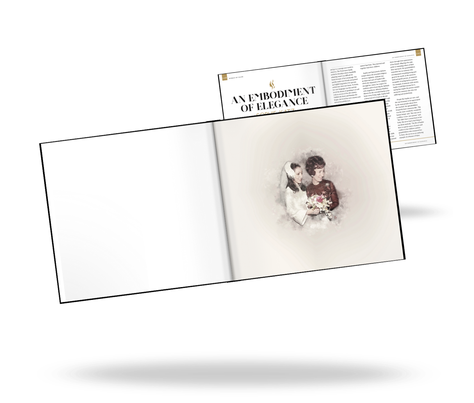
3. Digital Portrait Integration
Each digitally painted portrait was carefully retouched and formatted to complement the surrounding text, creating a seamless reading experience.
4. Editorial Flow & Layout
The layout was built to guide readers through each story with a steady, thoughtful rhythm by using:
✔ Gentle pacing between imagery and text to let each story breathe
✔ Ample white space to create a sense of calm and clarity
✔ Subtle design touches that quietly supported the book’s theme of empowerment
5. Print Production & Launch
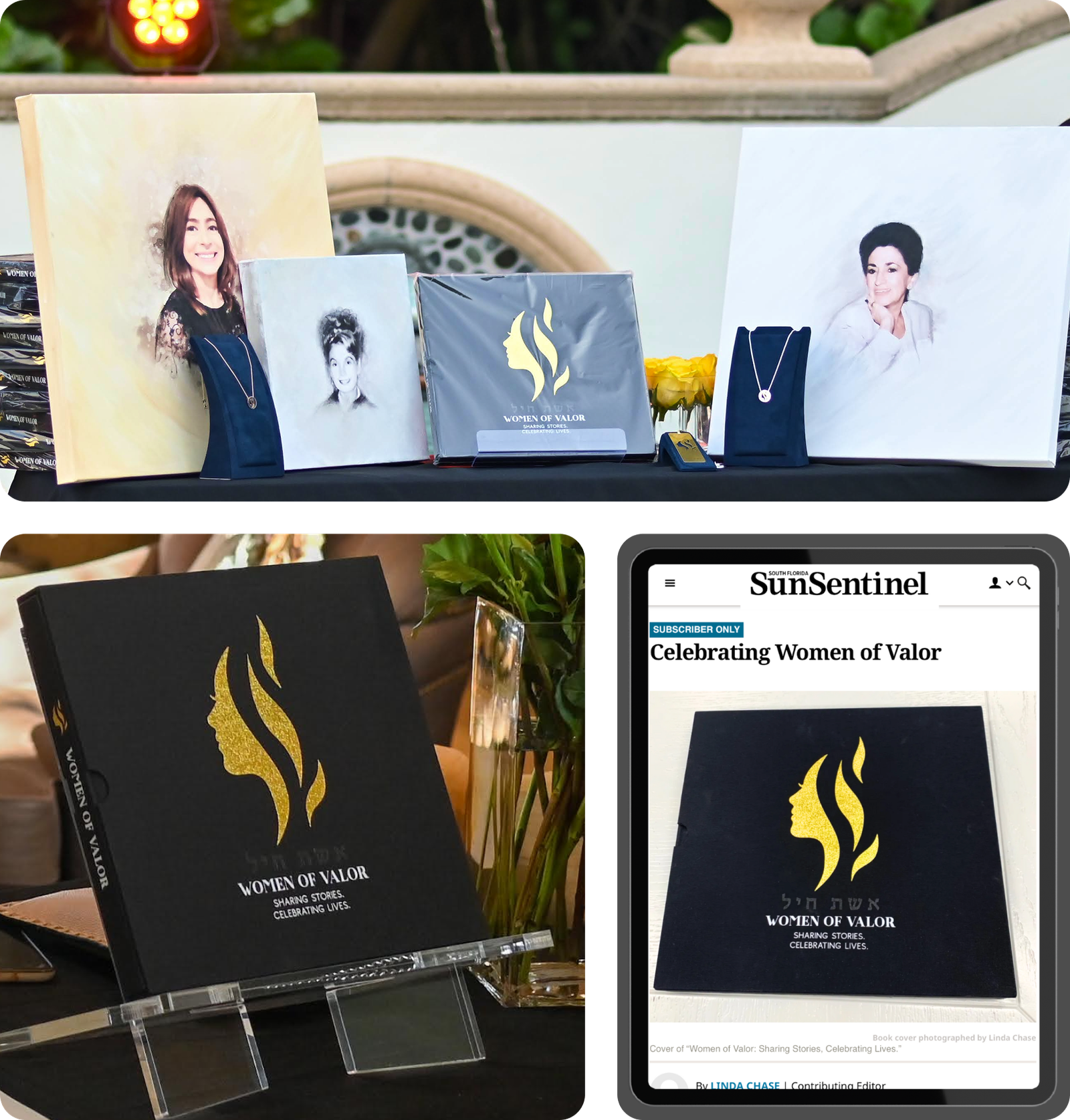
I prepped the final files for print and worked closely with the vendor to make sure the colors came through clearly and the materials felt just right.
The Outcome
✔ Published Coffee Table Book
The finished book became a meaningful tribute to the women in the community, with thoughtful feedback on both the design and the way their stories were shared.
✔ Community Event & Media Coverage
The book was unveiled at a community event, drawing positive feedback and engagement.
We were grateful to see the project featured in local media, which helped share its message more broadly.
Reflection
This project reminded me that good design goes beyond how something looks, it’s about how it connects with people. Through subtle layout decisions, and small, intentional details, Women of Valor became more than just a book. It turned into a heartfelt tribute to strength, resilience, and community.
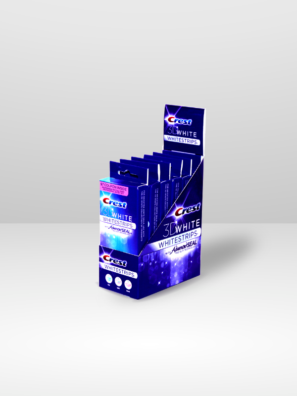

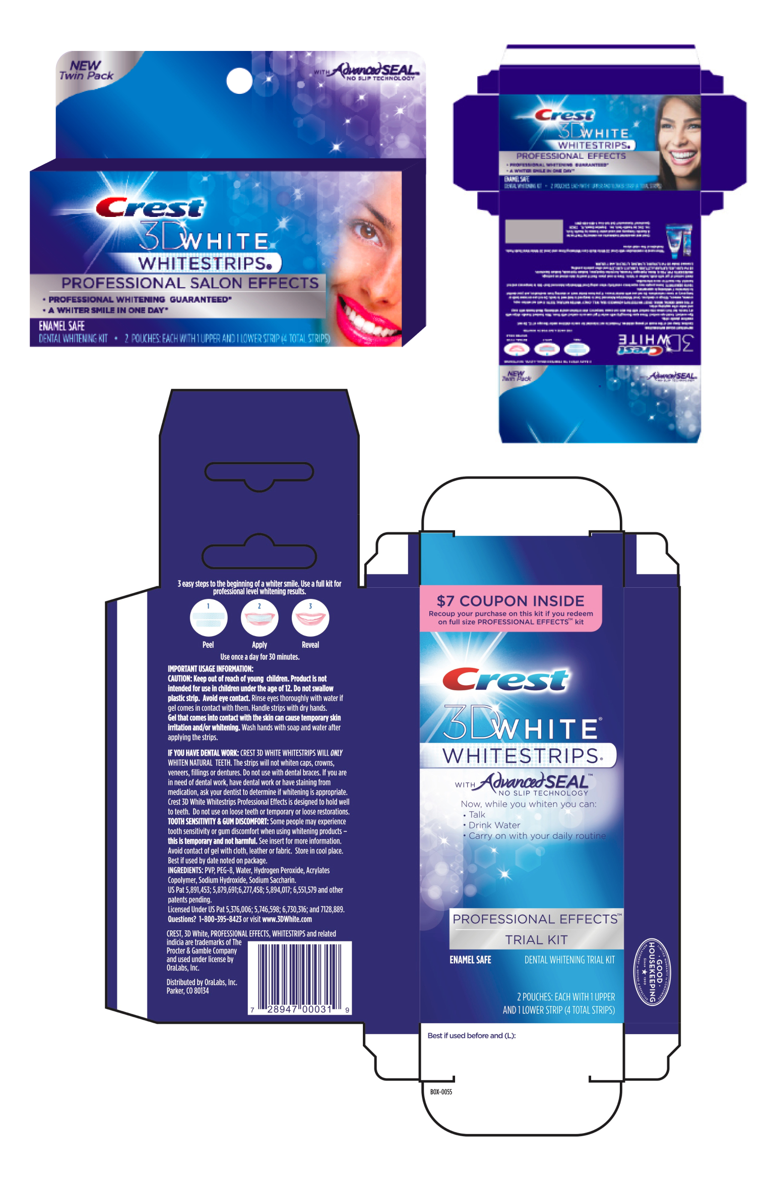
Crest® Whitestrips Packaging Design
Type
Package Design
Client
OTC Manufacturer
Year
2010
Tools
Adobe Creative Suite
Overview
Our team was tasked with developing a more compact, travel-friendly version of Crest® Whitestrips; designed specifically for checkout spaces, where shelf space is limited and decisions happen quickly.
The goal was to create packaging that felt familiar, trustworthy, and easy to understand, while staying true to Crest®'s well-established brand standards.
Challenge
Transitioning to a smaller format presented both opportunity and a few design constraints:
✔ Maintaining product clarity in a reduced layout
✔ Ensuring visibility in busy checkout environments
✔ Preserving brand consistency across packaging sizes
✔ Communicating benefits quickly and clearly to drive confident purchases, just as approachable and trustworthy as the full-size version
My Role
As the Visual and Package Designer on the project, I worked closely with the product and brand teams to:
* Explore layout options tailored to various retail formats
* Refine hierarchy and messaging for quick recognition
* Ensure visuals communicated benefits clearly and consistently
* Maintain alignment with Crest®’s visual identity across all packaging elements
Design Process
1. Research & Retail Context
We began by analyzing similar products in high-traffic checkout zones. The takeaway: simplicity, bold visuals, and a strong visual hierarchy help products succeed in fast-paced shopping environments.
2. Concept Exploration
Working from shared goals with the product team, we developed several layout directions. At each stage, we focused on:
✔ Making benefits and product name easy to recognize
✔ Maintaining a clean, reassuring tone
✔ Reflecting the look and feel of the broader Crest® brand system
3. Visual Refinement
We fine tuned the packaging through thoughtful adjustments to color, iconography, and typography. The goal was to balance approachability with brand trust, even in a smaller footprint.
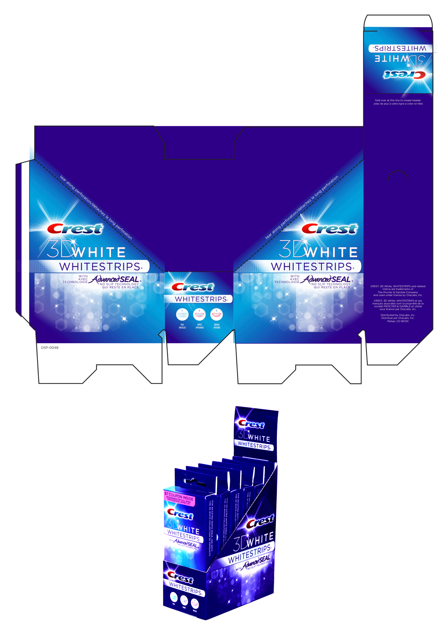
4. Checkout Display Considerations
Because this pack was intended for compact retail spaces, we approached the structure and display design with ease of use in mind; ensuring the product remained visible, understandable, and easy to access in tight shelf environments.
The Outcome
✔ On-Shelf Clarity:
A smaller format that retained clear, familiar visuals to support confident decision making.
✔ Brand Consistency:
Aligned closely with Crest®’s brand system to ensure a seamless connection to the full product line
✔ Retail Flexibility:
Designed for both standard shelves and checkout displays without losing impact
✔ Customer Confidence:
Clear messaging and simplified visuals supported an easy, trustworthy in store experience
Reflection
This project reinforced how thoughtful packaging can serve as a bridge between product and customer, especially in a fast moving retail environments. By focusing on visual clarity, brand alignment, and ease of use, we were able to support a positive experience in even the most compact of spaces.
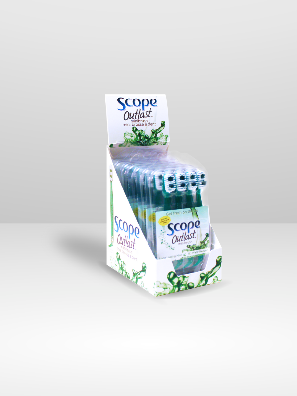
Scope® Outlast 4 in 1 Mini Brush
Packaging & Product Design
Type
Package Design
Client
OTC Manufacturer
Year
2011
Tools
Adobe Creative Suite
Overview
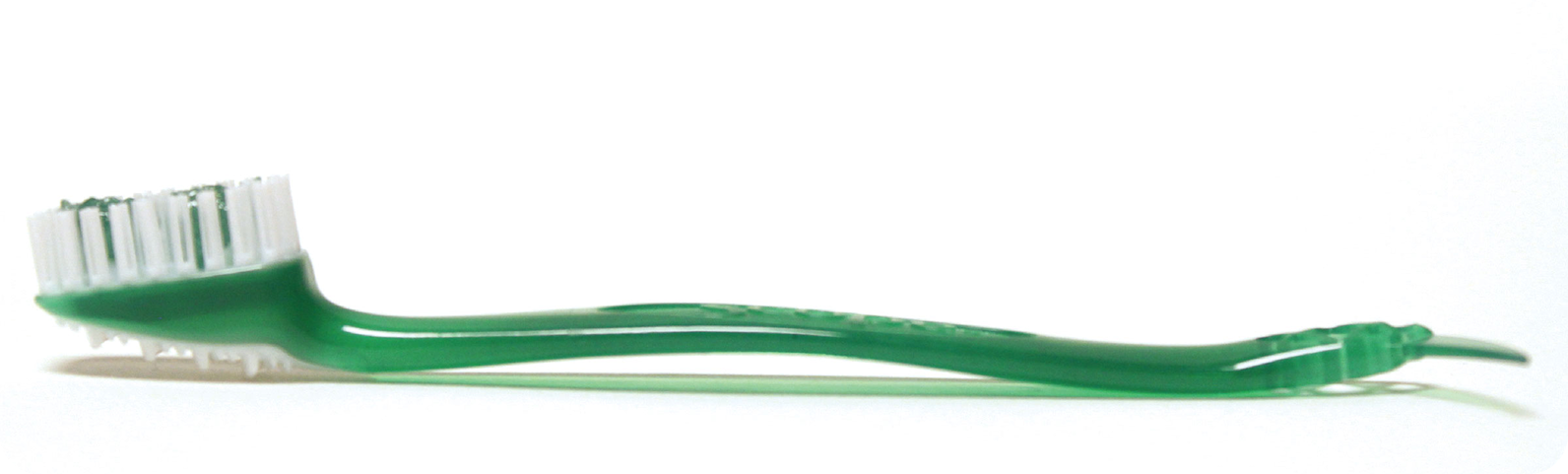
The Scope® Outlast 4-in-1 Mini Brush was created as a convenient, travel-sized toothbrush for people on the go; a disposable brush, pre-filled with Scope® Outlast breath freshener, designed to be small enough to fit into a pocket, purse, or gym bag.
This project involved close collaboration between product, packaging, and marketing teams to bring a new concept to life; from early ideation and prototyping to final packaging and marketing materials.
Challenge
While the idea was simple, our team was faced with creating a compact toothbrush that delivers freshness and ease. Turning this idea into a retail ready product meant considering a few key factors:
✔ Designing a product that truly fit into everyday routines and spaces
✔ Ensuring the breath freshening formula could be delivered effectively
✔ Creating packaging that clearly communicated function and portability
✔ Maintaining visual alignment with the Scope® Outlast brand system
My Role
As the Visual and Package Designer, I contributed across the product development cycle, helping shape:
* Packaging concepts designed for clarity and shelf impact
* Visual layouts that communicated product benefits simply
* Marketing assets tailored for retail & B2B environments
Design Process
1. Ideation & Product Development
The team began by exploring how the Scope® Outlast formula could be integrated into a brush that’s both effective and compact. A number of brush head prototypes were tested for comfort, functionality, and ease of use, all within tight spatial constraints.
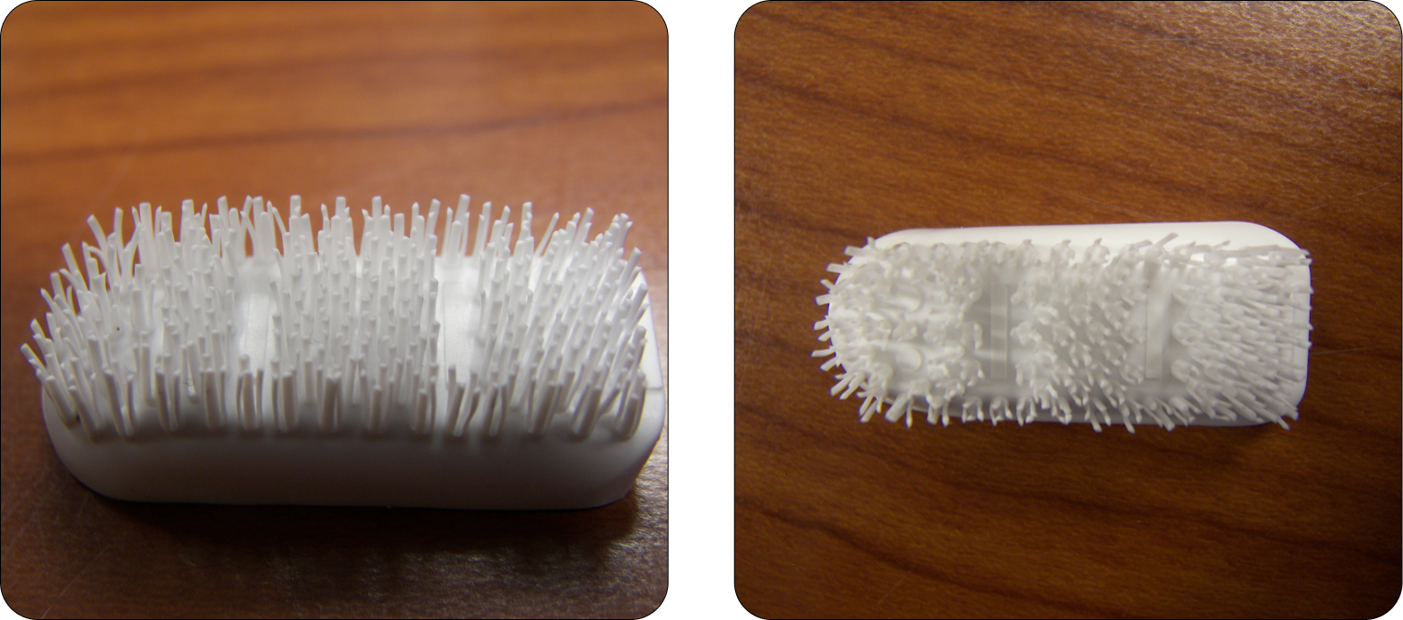
2. Final Product Design
After multiple rounds of user testing and refinement, the final Mini Brush design was approved; discreet, portable, and easy to use, with a focus on everyday convenience.
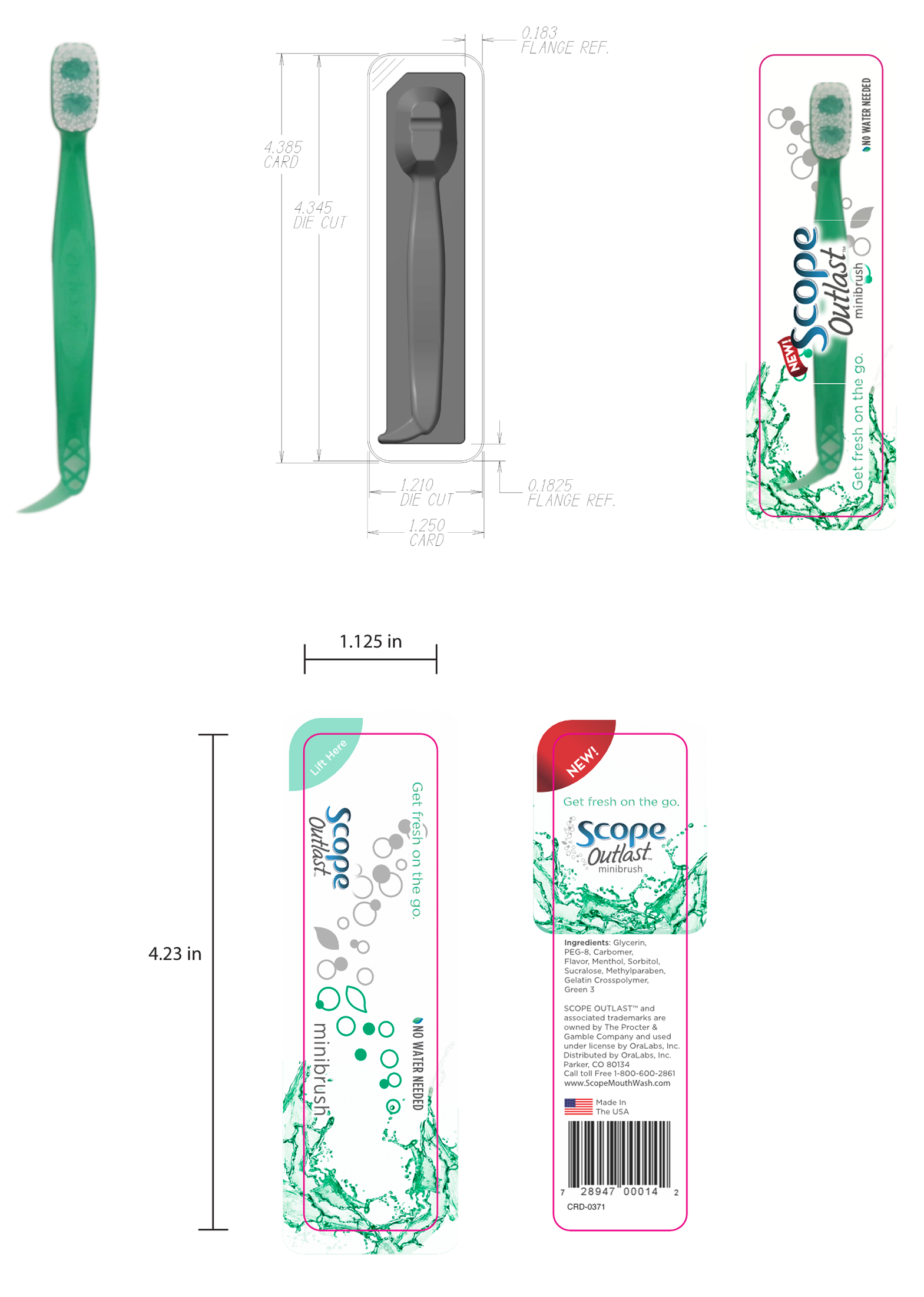
3. Packaging Concept Development
With the size, shape, and physical specs of the mini brush finalized, we turned our focus to the packaging. Our goals were to:
✔ Emphasize portability and simplicity
✔ Communicate the 4-in-1 benefits clearly at a glance
✔ Reflect Scope® Outlast’s familiar visual identity
Several layout directions were explored, tested for both clarity and on-shelf presence.
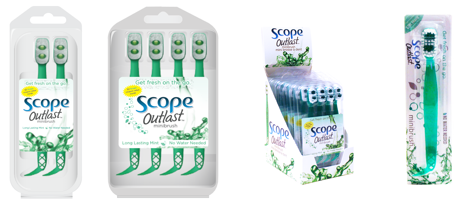
4. Final Packaging & Marketing Materials
The final packaging featured bold visuals and clear benefit callouts, designed for easy recognition. Supporting marketing materials highlighted the product’s convenience for travel, work, or post meal use on the go.
The Outcome
✔ A compact product design that delivered ease, freshness, and function
✔ Clear, approachable packaging that stayed true to Scope® branding
✔ Retail friendly structure, suited for travel, impulse, and checkout displays
✔ Messaging that supported quick understanding in busy shopping environments
Reflection
This project was a thoughtful mix of product and packaging design. It was a reminder that everyday items down to the simplest design requires clarity, intention, and collaboration. From early prototypes to final execution, each step helped shape a product that fits naturally into people’s lives, and delivers exactly what it promises.
Work
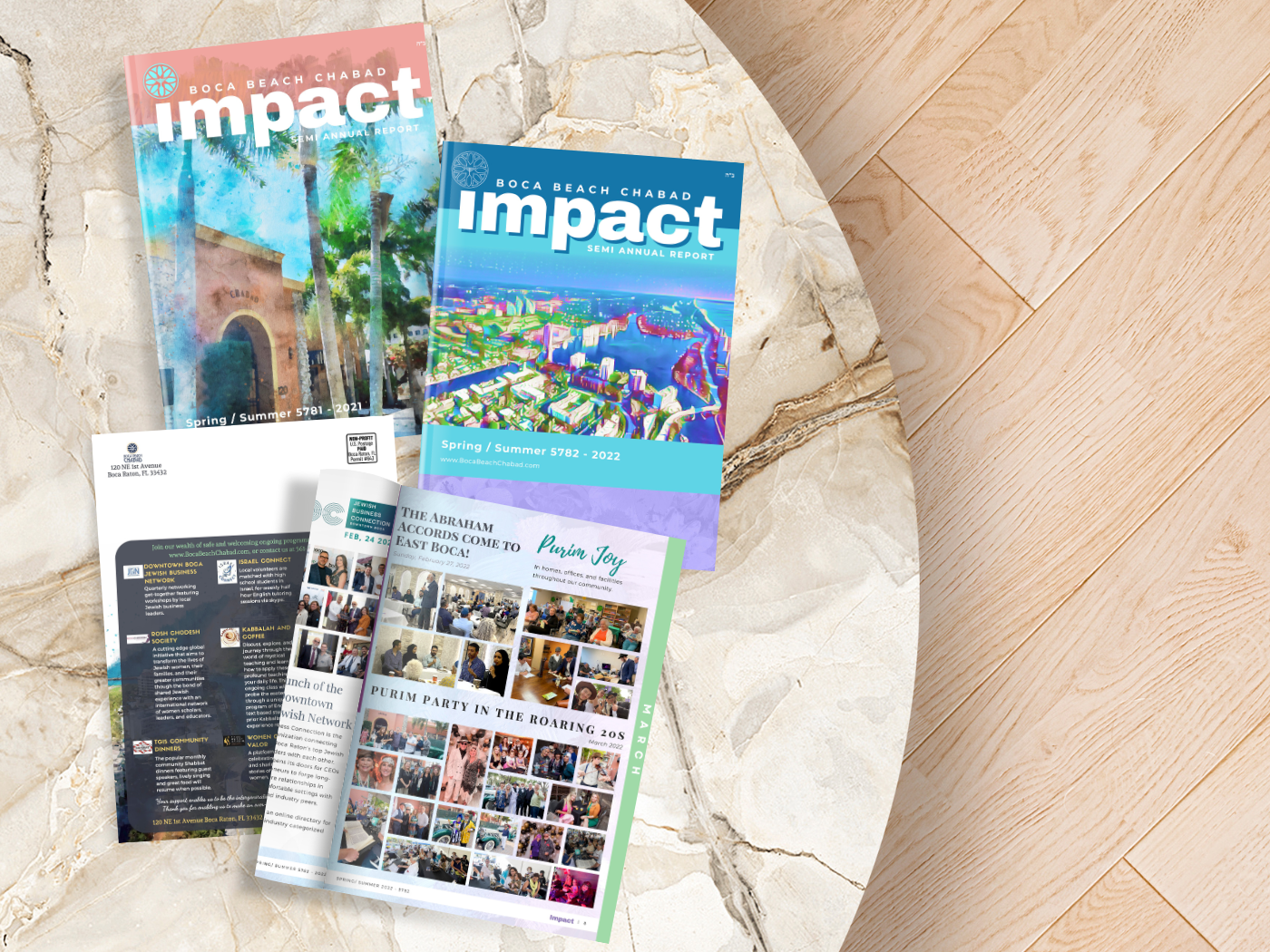
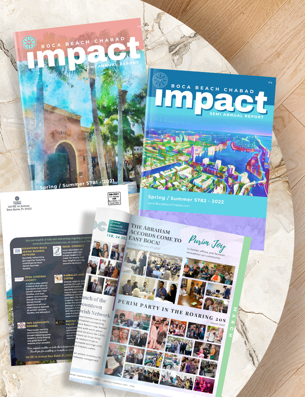
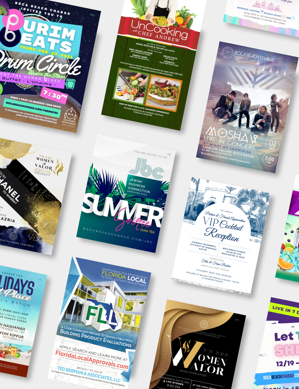
Annual Impact Reports Designed a series of vibrant semi-annual report magazines for a local nonprofit, highlighting community milestones, programs, and donor engagement.

P&G Private Label Package Design, Visual Design
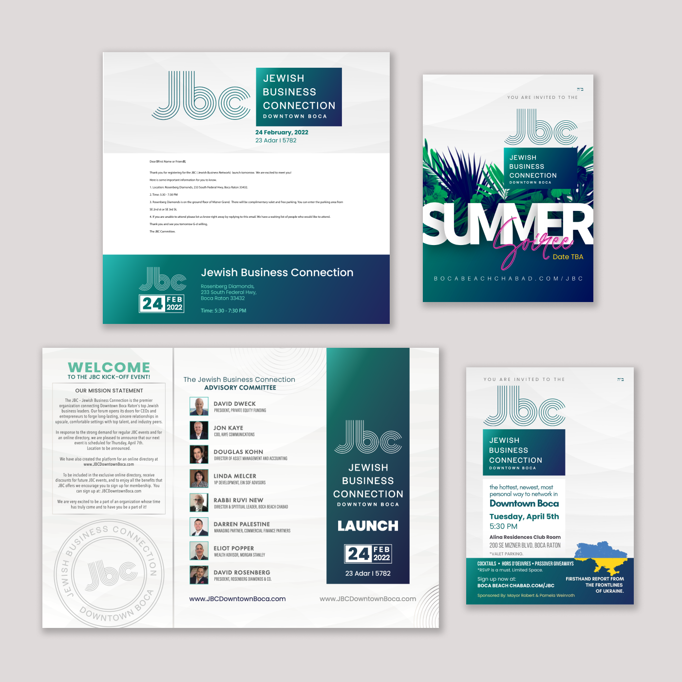
JBC Business Networking Visual Design, Email Templates & Direct Mail Campaign
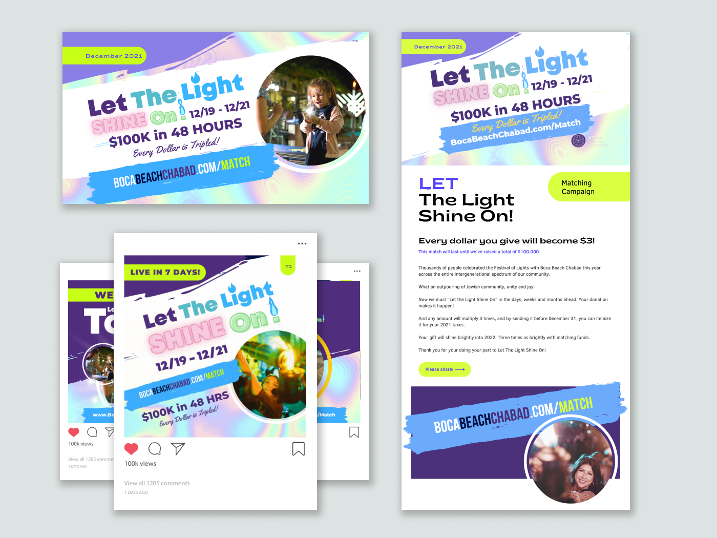
Let The Light Shine On Campaign Visual Designer, Digital & Direct Mail Campaigns
Let The Light Shine On Campaign Visual Designer, Campaign Marketing
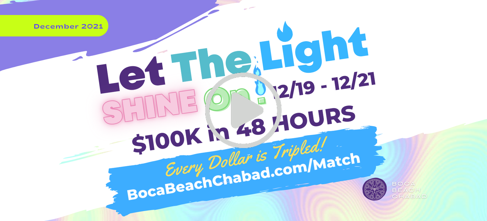
Let The Light Shine On Campaign Visual Designer, Campaign Marketing
Approach and
philosophy
Hi, I’m Mary — a visual designer who cares about creating thoughtful, beautiful work that connects with people. My background is rooted in packaging and branding, from over-the-counter products and vitamin labels to beverage packaging for both well-loved household names and small wellness brands. I’m happiest when I’m helping ideas take shape in a way that feels both purposeful and visually compelling.
I studied at Full Sail University in Winter Park, Florida, and got my start in oral care packaging before moving into freelance work across health, wellness and the small business sector. Most of my work has lived on shelves, but lately I’m drawn to the systems and structure behind digital products, and how good design can quietly support someone’s day to day.
Outside of work, I’m usually creating something by hand, watching a good game, or studing a new tool or technique to see how it works. I like small, useful details, well-labeled layers, and a clean grid.
Looking forward to doing good work that’s thoughtful, collaborative, and built to feel right to the user.

My education
Studying at Full Sail University involved a fast-paced, hands-on program with a deep focus on craft. Being part of a close-knit, driven cohort teaches the importance of being adaptable, working under pressure, and continuous learning.
My favourite tools
Adobe Creative Suite
Figma
Illustrator
In Design
Photoshop
After Effects
HTML5
CSS3
HubSpot
Monday.com
Notion
Canva
Courses
Figma
UI UX Design
Essentials
Figma
UI UX Design
Advanced
Salesforce
Platform
Developer I
Digital
Marketing
Agency